


When a famous company rebrands, almost everyone has an opinion on whether it was a good or bad idea and whether the new identity is beautiful or ugly. Rarely does anyone try to understand why the company took such a drastic decision (rebrandings are painful after all).
Unsurprisingly, when a rebranding is noticed by the public, it’s mostly because people don’t like it, don’t agree with it or don’t understand it (just think Uber, Instagram or Airbnb). If a rebranding is good, people simply don’t talk about it as it doesn’t evoke such strong emotions. In this series of articles, we will try to do exactly the opposite, as we will be appreciating good rebranding work from recent years.
To be considered a good exercise, we believe the rebrand should meet the following criteria:
– Solid and strategic reasons behind the decision to rebrand.
– Great execution, with the new identity delivering on the new strategy.
– The company’s built up brand equity from over the years taken into consideration, ensuring the rebrand doesn’t make the company do anything that isn’t in its DNA.
Here are our three choices:
Spotify
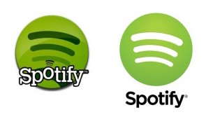
Towards the end of 2015, Spotify unveiled a new look and feel, making an attempt to move away from being identified as a tech company, instead hoping to give off the connotations of a music and entertainment brand. To do this, it had to become more lively, colourful and energetic, while remaining consistent.
At the front end of things, the logo remained the same (albeit in a slightly different shade of green), but the company created more branding assets, which helped it build a consistent brand experience. For example, one of the smartest ideas Spotify has come up with was the way they present photography coming from various artists in different styles. To keep their uniqueness and at the same to make the images look “on brand”, Spotify introduced duotone graphics, with the company’s logo also being used in a matching colour. This style of imagery was inspired by the way in which bands in the 60’s used to communicate with their audience. Spotify transformed but it stayed true to its music DNA.
Mastercard
Earlier this year, Mastercard announced a refresh of its identity, citing a solid reason – it wanted to be perceived as a provider of various electronic payment solutions (e.g. Masterpass), not just a credit card brand. The old look was also outdated and not optimised for the digital environment.
On the face of things, the rebrand was just a logo change, unveiling a new, more modern and simpler look. However, this isn’t where it ends – there were plenty of other changes in strategy and communication (e.g. extension of the “priceless” platform), and one subtle adjustment saw “MasterCard” become “Mastercard”. Dropping the capital ‘C’ helped the company de-emphasise the importance of the card business.
With the new logo being based on the old look, just with a new modern twist, Mastercard made sure that the rebrand takes into account the built-up brand equity.
![]()
American Airlines
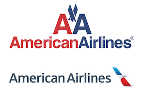
A couple of years ago, American Airlines revealed its new look, in an attempt to build a new, warmer and more welcoming brand personality, while unifying branding following a merger with U.S. Airways.
Since 1934, the logo of American Airlines used the initials A A, and was last redesigned in 1967 by Massimo Vignelli, a famous Italian designer. After over 40 years with the same logo, the rebrand in 2013 came to many as a surprise, for the first time not including the initials, just the full brand name and a flight shape, that replaced the wings and eagle of the old identity. Some people criticised this change as unnecessary but we absolutely agree with the rationale behind it and believe that the new identity builds a warmer brand image, at the same time taking advantage of the previous look and still using the American flag colours.
All three brands had good reasons to revamp their visual identities, executed the rebranding well and in the process didn’t forget about their brand DNA.
To read the complete brand strategy analyses mentioned above, join BrandStruck (https://brandstruck.co/pricing) and get access to our database.
If you need help with research or want to hire Magda for a brand project, email her at magda@brandstruck.co
To subscribe to our newsletter, simply email your address to brandstruck@brandstruck.co with the subject line ‘Newsletter’.
![]()
![]()
![]()
Magda Adamska is the founder of BrandStruck.
https://www.linkedin.com/in/magda-adamska-32379048/
BrandStruck is the only online database of brand strategy case studies.
BrandStruck’s mission is to empower brand builders worldwide with the best brand strategy practices and insights, showcased through 250+ case studies of the world’s most admired brands.