


Rebranding is always a hot topic for marketing journalists and bloggers and a hot potato for communications teams. It rarely goes without controversy as everyone, both inside a rebranded company and externally, has their own opinion whether it’s good or bad. It’s difficult to find another subject, which has so many self-proclaimed experts. After all, you don’t need a degree or any particular experience to tell whether a logo is pretty or ugly.
Well, what if you actually did?
In one of our previous posts, we covered the most common reasons (legitimate and not) why companies rebrand and the three biggest things to watch out for, when considering a change of visual identity. Now we take a look at four digital brands which have rebranded in the last 18 months and, instead of sharing our point of view on colours and fonts, we analyse the strategic thinking behind each of the rebrandings.
Here they are:
1. Instagram
In May, Instagram unveiled a complete branding overhaul, with a new logo, app icon and a redesign of both the app and website, seeing them take on a much more organised layout and easier to use interface. The new logo was inspired by the previous one – the camera looks simpler and more modern now, and the rainbow is present throughout the new logo in gradient form.
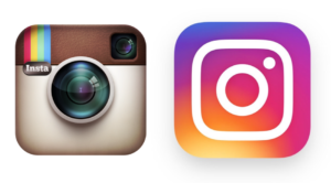
So, why would Instagram perform such a drastic change, despite being one of the world’s most recognisable brands? Judging by the reactions of most commentators, it was pure recklessness.
We disagree.
First of all, the brand needs to stay attractive to younger generations of users. If for 30-year-olds an image of an instant camera might bring back some memories and a warm feeling of nostalgia, it probably means nothing for teenagers. Secondly, it looked old-school, even though it was well-designed. It was ok when Instagram launched as a filter app that allowed users to make their pictures look a bit more retro and polaroid-like but today, it’s one of the biggest global social networks and it doesn’t want to be limited by its look. It has transformed and the new look expresses that. Thirdly, the new branding reflects the Instagram brand architecture – now Boomerang, Layout and Hyperlapse logotypes are unified visually with the main brand. And last but not least, why have a logo for such a great brand based on the brand asset belonging to a different company (Polaroid)?
2. Google
Last year, Google undertook its biggest branding change since inception. The Google logo has changed several times over the years, but the most recent redesign was the largest yet. The rebrand was largely front-end and based around user experience. As well as the new logo, there was also the new compact “G” mark, and Google’s coloured dots for transitional, loading moments of interactivity.
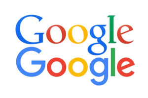
The Google rebrand coincided with the decision of the Google corporate brand becoming Alphabet. Now a new holding company owns not only Google but also has plenty of room in its portfolio for future acquisitions. The new look marked a new era for the internet giant, as it showed it was no longer just a search engine, but a technological umbrella, under which products such as Android, YouTube, Chrome and more are placed. Google’s rebrand didn’t meet a lot of criticism, mostly because the old look felt outdated and the new one was not too far from the previous. It felt almost like a natural and expected change.
3. Uber
Back in February, global mini-cab network, Uber, revealed changes to its branding, featuring a new logo and new individual app icons for users and partners. The rebrand also featured a new design framework to push Uber’s technology to the front of its communication, and new app colours to represent the scenery and culture of the countries Uber operates in.
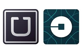
Again, the rebrand saw plenty of backlash. People couldn’t understand why Uber had changed something that worked.
Similarly to Instagram, Uber simply is not what it used to be and the new look is supposed to deliver a completely different message. When Uber launched, it was a black car only service – premium and exclusive. And the old, sleek identity with the dominance of the black colour screamed “not for everybody”. Today, Uber is a mainstream brand trying to attract people of different ages and backgrounds and the new look reflects just that. Additionally the new identity will make it easier for Uber to launch new products, sub-brands and endorsed brands under the umbrella brand.
4. Just Eat
Online takeaway food service Just Eat recently unveiled a new look as part of a big rebrand. Visually, the Just Eat app, website and logo have had a make-over. Red has remained the main colour, but brand imagery now features an extra spectrum of colour, as part of efforts to make Just Eat a more eye-catching product.
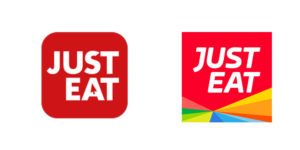
After several years of growing success, why did Just Eat think a rebrand was necessary? The company execs give a lot of reasons for that – to emphasise the choice Just Eat offers, to attract people who still order food via telephone or to recognise the new product launches and improvements. But sometimes reality is just simpler – the old identity was outdated and felt a bit like it had come from the early 2000’s. The new look is more contemporary and powerful and as such has a potential to attract more users.
Instagram, Google, Uber and Just Eat have all rebranded for the right reasons. Some of them were heavily criticised for that (Instagram and Uber) but in a few years’ time nobody will remember (like nobody seems to care today that Airbnb rebranded two years ago). The bigger the difference vs. the original logo, the more complaining. If you know your reasons for change are of a strategic nature and you tested your new identity in and out, then just simply keep calm and carry on – haters gonna hate but then they will forget.
If you need help with research or want to hire Magda for a brand project, email her at magda@brandstruck.co
To subscribe to our newsletter, simply email your address to brandstruck@brandstruck.co with the subject line ‘Newsletter’.
![]()
![]()
![]()
Magda Adamska is the founder of BrandStruck.
https://www.linkedin.com/in/magda-adamska-32379048/
BrandStruck is the only online database of brand strategy case studies.
BrandStruck’s mission is to empower brand builders worldwide with the best brand strategy practices and insights, showcased through 250+ case studies of the world’s most admired brands.